
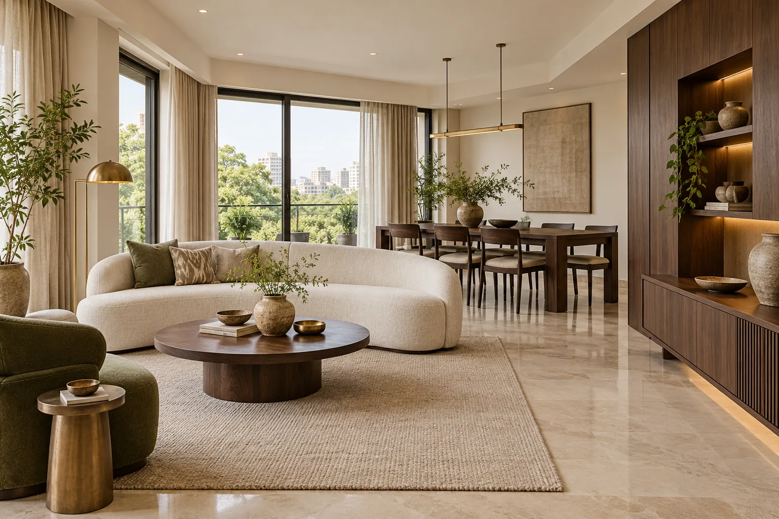
For years, pale oak, whitewashed finishes and near-invisible joinery defined the default idea of a contemporary home. Now richer timber is returning—not as a nostalgic recreation of heavy, formal rooms, but as a way to add depth, warmth and permanence to otherwise restrained interiors.
The shift is especially relevant in India, where wood has always carried associations of craft, continuity and everyday use. Recent coverage in The New Indian Express describes dark timber as a material correction after years of bleached woods, while The Indian Express notes that the new approach relies on balance rather than excess. The useful lesson is not that every room should turn brown. It is that one well-placed dark element can make a light room feel more grounded.
Start with the role, not the wood shade
Before selecting walnut, smoked oak, teak or a stained veneer, decide what the dark timber should do. A dining table can become the visual anchor of an open-plan room. A media unit can create a calm horizontal line. A full-height wardrobe may give a bedroom a cocooning edge, while a slim entrance console can establish character without demanding much space.
Dark wood works best when its purpose is clear. If every door, panel, floor and loose furniture item shares the same deep finish, the eye has nowhere to rest. Choose one dominant application and let the remaining timber sit a few tones lighter—or replace it with stone, fabric, metal or paint. This hierarchy keeps the room composed rather than themed.
Use contrast to protect the sense of space
The simplest way to keep rich timber from feeling heavy is to surround it with breathing room. Warm whites, sand, oatmeal and muted greige give dark grain a clean background. Pale stone and quiet fabrics reflect more light than another glossy brown surface. A lighter rug beneath a dark table separates it visually from the floor and helps the furniture read as a deliberate object.
Contrast does not have to mean stark black-and-white styling. A walnut cabinet beside a limewashed beige wall, an espresso headboard against textured ivory fabric or a dark dining table paired with upholstered chairs can feel soft and layered. Architectural Digest India’s 2026 trends report connects richer brown tones with lighter neutrals and identifies wood panelling and architectural timber surfaces as renewed areas of interest. The common thread is material depth with restraint.
Let natural grain do the decorative work
Dark timber can quickly become visually dense when paired with elaborate profiles, high-gloss polish or too many ornamental details. Cleaner silhouettes allow the grain to remain visible and make the material feel current. Flat or subtly framed cabinet fronts, slim edges and considered joinery usually need less additional decoration.
This is also where samples matter. View a large finish sample vertically and horizontally because grain direction changes the effect. Check it in morning daylight, evening light and the artificial lighting planned for the room. A finish that appears warm and nuanced in a showroom may look almost black in a shaded apartment. Finalise the tone only after comparing it beside the actual wall, flooring, upholstery and countertop samples.
Plan lighting around the material
Dark wood absorbs more light visually than pale finishes, so lighting cannot be an afterthought. Begin with daylight: avoid placing bulky dark cabinetry where it blocks a useful window or narrows a passage. Then add artificial light in layers. General ceiling light supports circulation; wall washers or concealed shelf lights reveal grain; and a pendant or floor lamp creates an inviting pool of light around a key piece.
Avoid blasting the timber with a single harsh spotlight. Uneven glare can flatten the colour and exaggerate reflections. Softer, well-positioned light shows the surface more honestly. If cabinetry includes display niches, illuminate the objects and back panel gently rather than turning the entire unit into a glowing showcase.
Pair dark wood with materials that lighten the composition
Stone, glass, linen, cane, metal and handmade ceramics all offer useful counterpoints. Light marble or quartz can sharpen a dark kitchen island. Fluted or clear glass breaks up a tall bank of cabinetry. Woven upholstery and matte plaster soften the precision of finished wood. Small touches of brass can add warmth, but they are most effective when used sparingly.
For an Indian home, the combination can also make room for objects with personal or regional meaning: a carved heirloom chair beside a contemporary sofa, a handloom textile against a clean timber panel or a ceramic collection on a slim shelf. The dark background gives these pieces presence without requiring a conventionally “traditional” room.
Adapt the idea to the size of the home
In a compact apartment, introduce the look through a coffee table, bedside units, a bench or a single run of lower cabinetry. Keep tall dark elements away from already narrow sightlines, and consider open legs or floating units so more floor remains visible. Mirrors and glass should support the layout rather than serve as a cure for overcrowding.
In a larger home, dark wood can move from furniture into architecture: a library wall, ceiling feature, sliding partition or integrated bar. Even then, repetition needs control. Carrying the same timber into two or three connected areas can create continuity; wrapping every room in it can dilute the effect.
Coordinate the finish before production begins
Rich timber is unforgiving when different vendors interpret “walnut” or “espresso” differently. A successful result depends on an approved physical sample, agreed sheen level, grain direction and edge treatment. Hardware, lighting channels and junctions with stone should be resolved before fabrication. This is one reason to involve home interior designers in Bangalore early: cabinetry, electrical points, lighting and adjacent finishes can be reviewed as one composition rather than as separate purchases.
For a coordinated approach from design through production and site installation, explore The Foyer2Attic Advantage. If you are planning a home and want help deciding where richer timber will add value without overwhelming the rooms, start a conversation with the studio.
A warmer modernism, not a return to heaviness
The renewed interest in dark wood is most useful when treated as a design tool rather than a trend to copy. It can anchor a pale room, connect contemporary interiors to Indian craft traditions and make a home feel collected over time. The modern version relies on proportion, contrast, light and honest grain. Choose fewer applications, execute them well and give the material enough space to be noticed.